Summary statistics
Overview of three examples of how summary statistics can hide differences that are exposed through visualisation
The three sources are:
See also (not considered here): https://journals.plos.org/plosbiology/article?id=10.1371/journal.pbio.1002128
import pandas as pd

from IPython.display import display_html
from itertools import chain,cycle

import numpy as np
import matplotlib.pyplot as plt
Anscombe (1973)
# define file locations

path = '/Users/aidanair/Documents/DATA/ALL_DATASETS/anscombe_csvs/'

file1 = 'ans1.csv'
file2 = 'ans2.csv'
file3 = 'ans3.csv'
file4 = 'ans4.csv'

# read in and assign to four different variables

one = pd.read_csv(path + file1)
two = pd.read_csv(path + file2)
three = pd.read_csv(path + file3)
four = pd.read_csv(path + file4)
# VERY HELPFUL FUNCTION TAKEN FROM THIS STACK OVERFLOW USER TO DISPLAY DATAFRAMES SIDE BY SIDE
# https://stackoverflow.com/questions/38783027/jupyter-notebook-display-two-pandas-tables-side-by-side

def display_side_by_side(*args, titles=cycle([''])):
    html_str=''

    for df,title in zip(args, chain(titles,cycle(['</br>'])) ):
        html_str+='<th style="text-align:center"><td style="vertical-align:top">'
        html_str+=f'<h2>{title}</h2>'
        html_str+=df.to_html().replace('table','table style="display:inline"')
        html_str+='</td></th>'

    display_html(html_str,raw=True)
# run function: show data in the four dfs

display_side_by_side(one, two, three, four, titles=['one','two', 'three', 'four'])
one
| x1 | y1 | |
|---|---|---|
| 0 | 10 | 8.04 |
| 1 | 8 | 6.95 |
| 2 | 13 | 7.58 |
| 3 | 9 | 8.81 |
| 4 | 11 | 8.33 |
| 5 | 14 | 9.96 |
| 6 | 6 | 7.24 |
| 7 | 4 | 4.26 |
| 8 | 12 | 10.84 |
| 9 | 7 | 4.82 |
| 10 | 5 | 5.68 |
two
| x2 | y2 | |
|---|---|---|
| 0 | 10 | 9.14 |
| 1 | 8 | 8.14 |
| 2 | 13 | 8.74 |
| 3 | 9 | 8.77 |
| 4 | 11 | 9.26 |
| 5 | 14 | 8.10 |
| 6 | 6 | 6.13 |
| 7 | 4 | 3.10 |
| 8 | 12 | 9.13 |
| 9 | 7 | 7.26 |
| 10 | 5 | 4.74 |
three
| x3 | y3 | |
|---|---|---|
| 0 | 10 | 7.46 |
| 1 | 8 | 6.77 |
| 2 | 13 | 12.74 |
| 3 | 9 | 7.11 |
| 4 | 11 | 7.81 |
| 5 | 14 | 8.84 |
| 6 | 6 | 6.08 |
| 7 | 4 | 5.39 |
| 8 | 12 | 8.15 |
| 9 | 7 | 6.42 |
| 10 | 5 | 5.73 |
four
| x4 | y4 | |
|---|---|---|
| 0 | 8 | 6.58 |
| 1 | 8 | 5.76 |
| 2 | 8 | 7.71 |
| 3 | 8 | 8.84 |
| 4 | 8 | 8.47 |
| 5 | 8 | 7.04 |
| 6 | 8 | 5.25 |
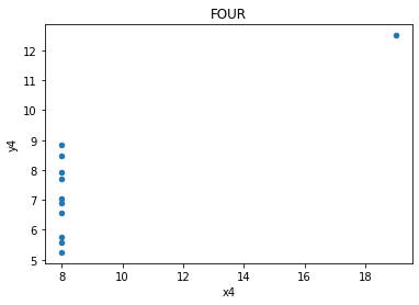
| 7 | 19 | 12.50 |
| 8 | 8 | 5.56 |
| 9 | 8 | 7.91 |
| 10 | 8 | 6.89 |
# show summary statistics (function will run with added methods chained on)

display_side_by_side(one.describe().round(2),
                     two.describe().round(2),
                     three.describe().round(2),
                     four.describe().round(2),
                     titles=['one','two', 'three', 'four'])
one
| x1 | y1 | |
|---|---|---|
| count | 11.00 | 11.00 |
| mean | 9.00 | 7.50 |
| std | 3.32 | 2.03 |
| min | 4.00 | 4.26 |
| 25% | 6.50 | 6.32 |
| 50% | 9.00 | 7.58 |
| 75% | 11.50 | 8.57 |
| max | 14.00 | 10.84 |
two
| x2 | y2 | |
|---|---|---|
| count | 11.00 | 11.00 |
| mean | 9.00 | 7.50 |
| std | 3.32 | 2.03 |
| min | 4.00 | 3.10 |
| 25% | 6.50 | 6.70 |
| 50% | 9.00 | 8.14 |
| 75% | 11.50 | 8.95 |
| max | 14.00 | 9.26 |
three
| x3 | y3 | |
|---|---|---|
| count | 11.00 | 11.00 |
| mean | 9.00 | 7.50 |
| std | 3.32 | 2.03 |
| min | 4.00 | 5.39 |
| 25% | 6.50 | 6.25 |
| 50% | 9.00 | 7.11 |
| 75% | 11.50 | 7.98 |
| max | 14.00 | 12.74 |
four
| x4 | y4 | |
|---|---|---|
| count | 11.00 | 11.00 |
| mean | 9.00 | 7.50 |
| std | 3.32 | 2.03 |
| min | 8.00 | 5.25 |
| 25% | 8.00 | 6.17 |
| 50% | 8.00 | 7.04 |
| 75% | 8.00 | 8.19 |
| max | 19.00 | 12.50 |
# what about correlation between x and y in the four datasets? The same up to three decimal points

print(np.corrcoef(one.x1, one.y1)[1][0].round(5))
print(np.corrcoef(two.x2, two.y2)[1][0].round(5))
print(np.corrcoef(three.x3, three.y3)[1][0].round(5))
print(np.corrcoef(four.x4, four.y4)[1][0].round(5))
0.81642
0.81624
0.81629
0.81652
# plot the four datasets
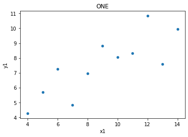
one.plot(kind = 'scatter', x = 'x1', y = 'y1', title = 'ONE');
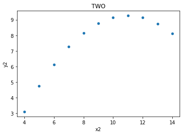
two.plot(kind = 'scatter', x = 'x2', y = 'y2', title = 'TWO');
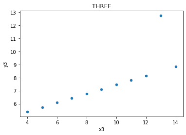
three.plot(kind = 'scatter', x = 'x3', y = 'y3', title = 'THREE');
four.plot(kind = 'scatter', x = 'x4', y = 'y4', title = 'FOUR');
Lines
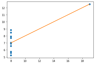
The relationships between x values and y values are similar when seen in lines, but of course are not the same, as the data is not the same (just the measures of central tendancy)
# define the two sets of data
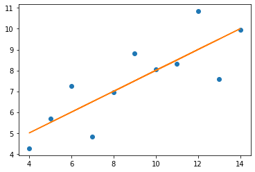
x = np.array(one.x1)
y = np.array(one.y1)
plt.plot(x, y, 'o')
# establish the slope (m) and the intercept (c)
m, c = np.polyfit (x, y, 1)
# plot the linear regression
plt.plot (x, m * x + c)
# print the value of the slope and where it's situated (in terms of the y-axis)
print('slope:', m.round(5), 'y-int:', c.round(5))
slope: 0.50009 y-int: 3.00009
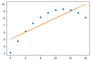
x = np.array(two.x2)
y = np.array(two.y2)
plt.plot(x, y, 'o')

m, c = np.polyfit (x, y, 1)

plt.plot (x, m * x + c)

print('slope:', m.round(5), 'y-int:', c.round(5))
slope: 0.5 y-int: 3.00091
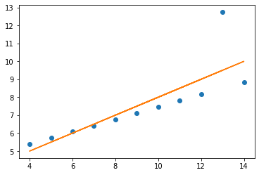
x = np.array(three.x3)
y = np.array(three.y3)
plt.plot(x, y, 'o')

m, c = np.polyfit (x, y, 1)

plt.plot (x, m * x + c)

print('slope:', m.round(5), 'y-int:', c.round(5))
slope: 0.49973 y-int: 3.00245
x = np.array(four.x4)
y = np.array(four.y4)
plt.plot(x, y, 'o')

m, c = np.polyfit (x, y, 1)

plt.plot (x, m * x + c)

print('slope:', m.round(5), 'y-int:', c.round(5))
slope: 0.49991 y-int: 3.00173
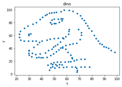
Datasaurus (2016)
path = '/Users/aidanair/Documents/DATA/ALL_DATASETS/'
file = 'datasaurus_data.csv'

cols = ['town_A', 'town_B']
din = pd.read_csv(path + file, names = cols)
# say the data refers to two towns...

din
| town_A | town_B | |
|---|---|---|
| 0 | 55.3846 | 97.1795 |
| 1 | 51.5385 | 96.0256 |
| 2 | 46.1538 | 94.4872 |
| 3 | 42.8205 | 91.4103 |
| 4 | 40.7692 | 88.3333 |
| ... | ... | ... |
| 137 | 39.4872 | 25.3846 |
| 138 | 91.2821 | 41.5385 |
| 139 | 50.0000 | 95.7692 |
| 140 | 47.9487 | 95.0000 |
| 141 | 44.1026 | 92.6923 |
142 rows × 2 columns
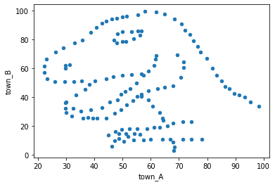
# scatter plot to show any trends in the relationship betwen the data in town A, and the data in town B

din.plot.scatter(x = 'town_A', y = 'town_B');
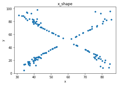
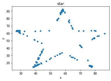
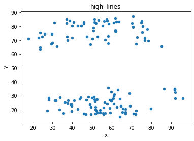
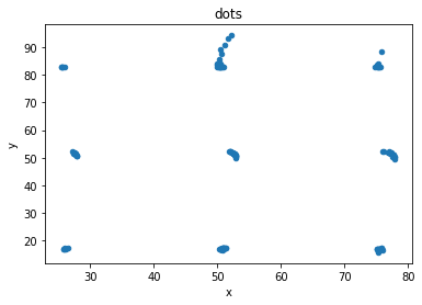
Datasaurus dozen (2017)
path = '/Users/aidanair/Documents/DATA/ALL_DATASETS/'
file1 = 'DatasaurusDozen.tsv'

d = pd.read_csv(path + file1, sep = "\t")
print(d.shape)
d[:3]
(1846, 3)
| dataset | x | y | |
|---|---|---|---|
| 0 | dino | 55.3846 | 97.1795 |
| 1 | dino | 51.5385 | 96.0256 |
| 2 | dino | 46.1538 | 94.4872 |
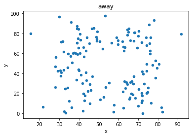
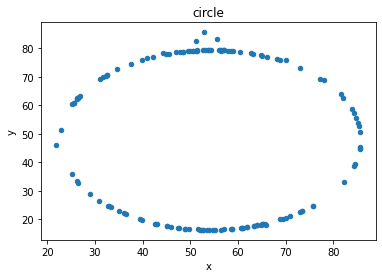
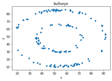
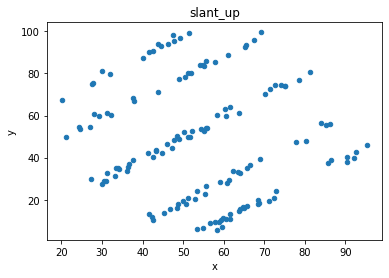
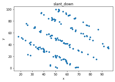
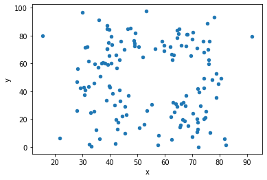
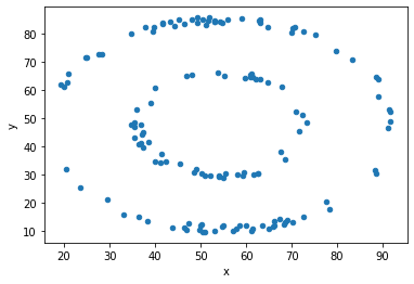
“These 13 datasets (the Datasaurus, plus 12 others) each have the same summary statistics (x/y mean, x/y standard deviation, and Pearson’s correlation) to two decimal places, while being drastically different in appearance.”
## Consider two of the dozen

display_side_by_side(d[d.dataset == 'away'].head(),
                     d[d.dataset == 'bullseye'].head(),
                     titles=['away','bullseye'])
away
| dataset | x | y | |
|---|---|---|---|
| 142 | away | 32.331110 | 61.411101 |
| 143 | away | 53.421463 | 26.186880 |
| 144 | away | 63.920202 | 30.832194 |
| 145 | away | 70.289506 | 82.533649 |
| 146 | away | 34.118830 | 45.734551 |
bullseye
| dataset | x | y | |
|---|---|---|---|
| 1278 | bullseye | 51.203891 | 83.339777 |
| 1279 | bullseye | 58.974470 | 85.499818 |
| 1280 | bullseye | 51.872073 | 85.829738 |
| 1281 | bullseye | 48.179931 | 85.045117 |
| 1282 | bullseye | 41.683200 | 84.017941 |
# Show the correlation measure, and the mean and std for x values and y values in each of the two datasets

print('(Pearson) Correlation between x and y values for "Away" and "Bullseye" datasets')
print('Away:', np.corrcoef(d[d.dataset == 'away'].x, d[d.dataset == 'away'].y)[1][0].round(3))
print('Bullseye:', np.corrcoef(d[d.dataset == 'bullseye'].x, d[d.dataset == 'bullseye'].y)[1][0].round(3))

display_side_by_side(d[d.dataset == 'away'].describe().round(2),
                     d[d.dataset == 'bullseye'].describe().round(2),
                     titles=['away','bullseye'])
(Pearson) Correlation between x and y values for "Away" and "Bullseye" datasets
Away: -0.064
Bullseye: -0.069
away
| x | y | |
|---|---|---|
| count | 142.00 | 142.00 |
| mean | 54.27 | 47.83 |
| std | 16.77 | 26.94 |
| min | 15.56 | 0.02 |
| 25% | 39.72 | 24.63 |
| 50% | 53.34 | 47.54 |
| 75% | 69.15 | 71.80 |
| max | 91.64 | 97.48 |
bullseye
| x | y | |
|---|---|---|
| count | 142.00 | 142.00 |
| mean | 54.27 | 47.83 |
| std | 16.77 | 26.94 |
| min | 19.29 | 9.69 |
| 25% | 41.63 | 26.24 |
| 50% | 53.84 | 47.38 |
| 75% | 64.80 | 72.53 |
| max | 91.74 | 85.88 |
# plot both datasets, with their (almost) identical mean, std and correlation

df = d[d.dataset == 'away']
df.plot(kind = 'scatter', x = 'x', y = 'y');

df = d[d.dataset == 'bullseye']
df.plot(kind = 'scatter', x = 'x', y = 'y');
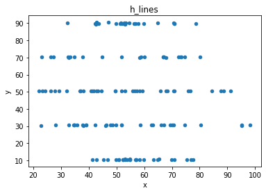
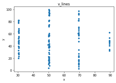
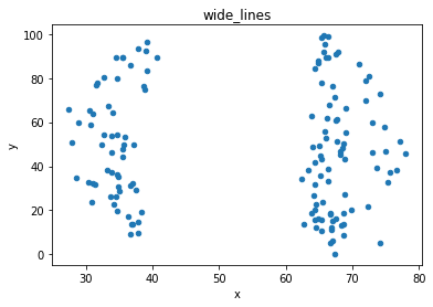
# plot the dinosaur and the dozen others

sets = d.dataset.unique().tolist()

for x in sets:
    df = d[d.dataset == x]
    df.plot(kind = 'scatter', x = 'x', y = 'y', title = x)