WALKTHROUGH: Simple bar chart in datawrapper
There are many tools available for visualising data, all different in cost, complexity and what they can do. Datawrapper, Rawgraphs and Flourish are online tools that offer a lot for free and let you publish or embed charts quickly. Below, we take some simple data — the ten retail companies that distributed the most plastic bags in 2019-20 — and start to create a bar chart in Datawrapper. You can then explore the tool to see how best to finish the chart.
PREPARE YOUR DATA
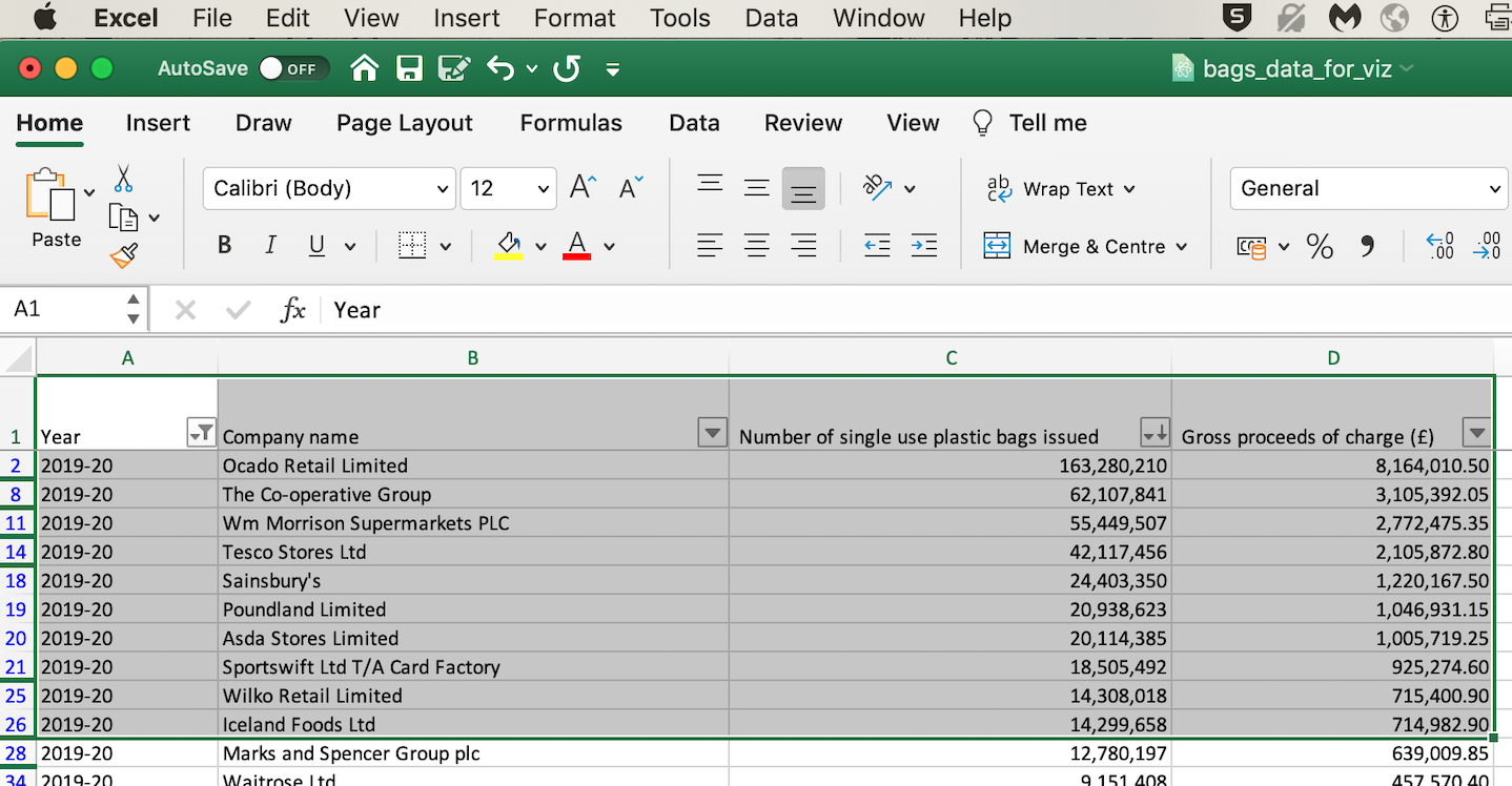
It’s a good idea to prepare your data first so that it doesn’t require too much adjusting or editing while you’re visualising it. Open the spreadsheet you used for single-use plastic bags in England.
(Alternatively, import the data again from the bags_2years.csv file to a new spreadsheet and organise the sheet as shown in the first Walkthrough)
Filter the ‘Year’ column to show only 2019-20 and sort the ‘Number of single-use plastic bags’ column (‘from Z-A’) so the data is organised with the biggest numbers at the top.
Select all the data in the first eleven rows (including the column headers).
Copy the rows (either Edit/Copy in the menu or CMD / CTRL + C). Add a new sheet using the + in the bottom left.
Paste the copied rows into the new sheet. Then clean up the data you’ve just paste:
- Remove the ‘Year’ column (Select column A, then right click + ‘Delete’)
- Simplify the column names (for example: company, number of bags, proceeds (£))
- Hide the pence (decimal places) from the proceeds column (Format then Cells)
- Simplify the names of the retailers (‘Poundland Limited’ as ‘Poundland’ for example)
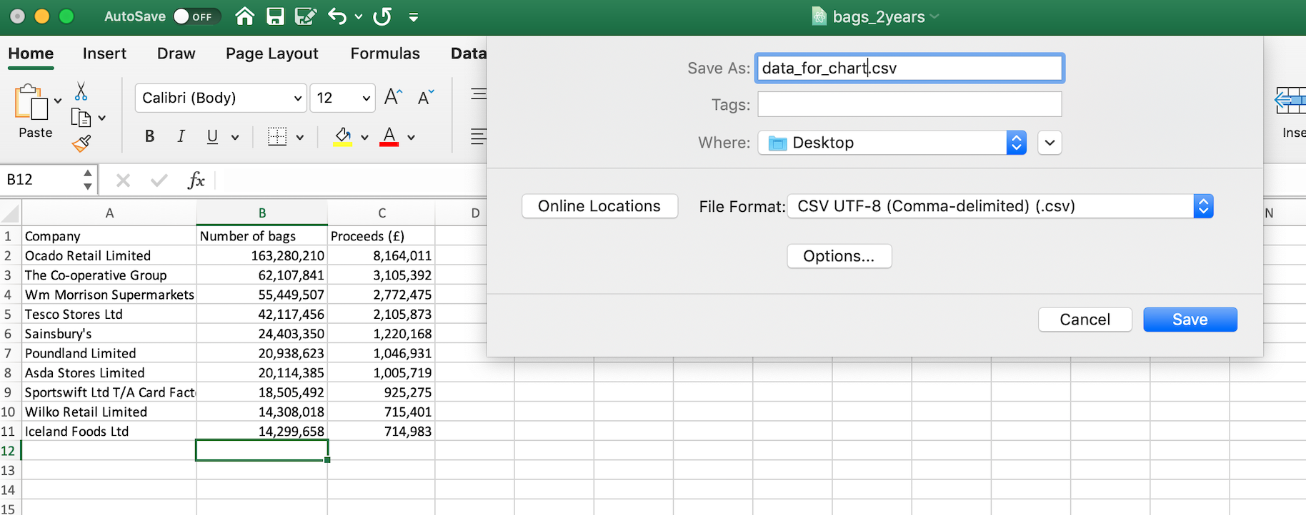
On the bottom left, rename the sheet you’re working in (from ‘Sheet4’)
Now in File, choose Save As and under File format choose CSV UTF-8 (.csv), give it a helpful name like ‘data_for_chart.csv’ and save the file somewhere on your computer
(Excel will warn us that we’re only saving the sheet we’re looking at and not all the sheets in the spreadsheet. That’s ok)
INGEST YOUR DATA
Visit the Datawrapper site. Creating your own account is the simplest and will let you save and reuse your material, but it’s not essential
Under the question How do you want to upload your data?, choose the second tab XLS/CSV upload since we have a CSV file
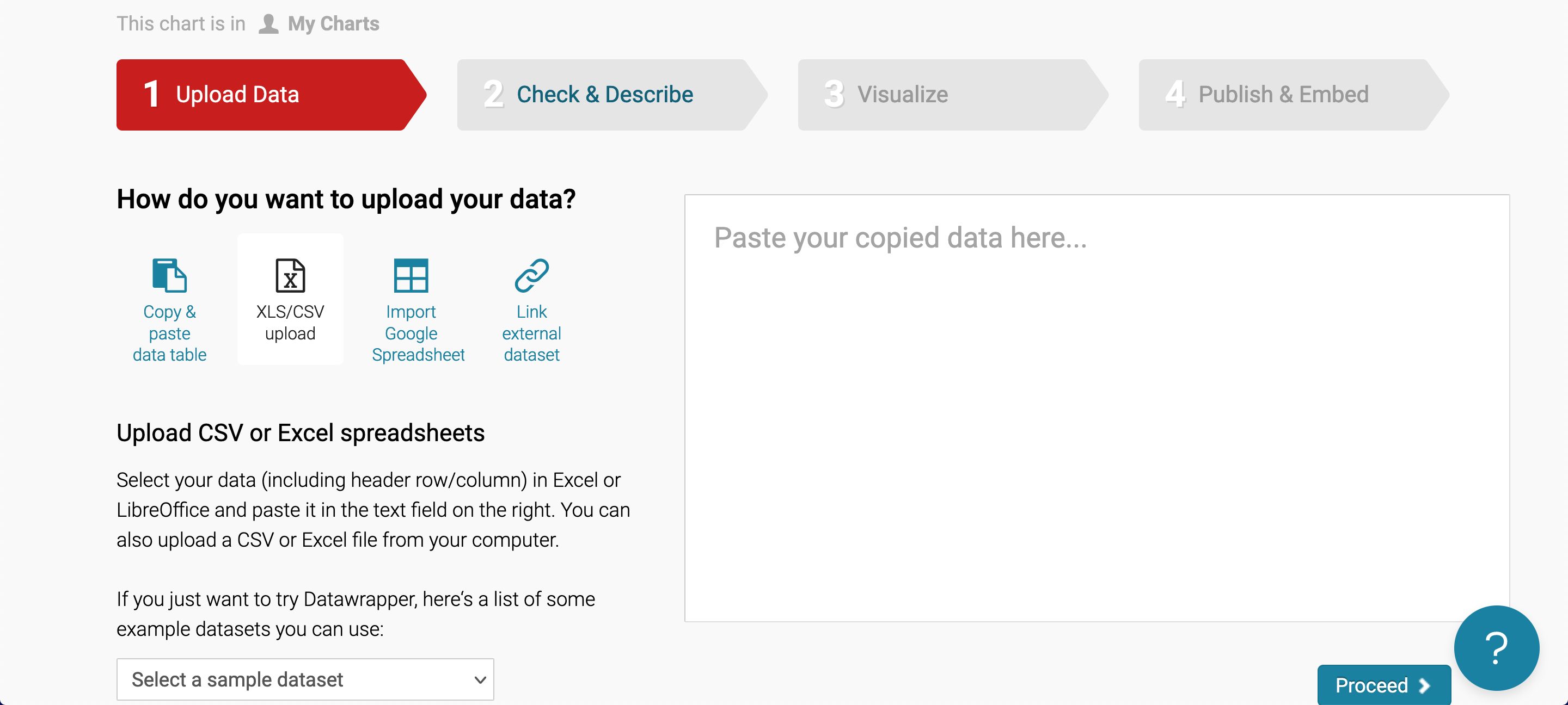
Check that the data has been imported correctly. Then hit Proceed
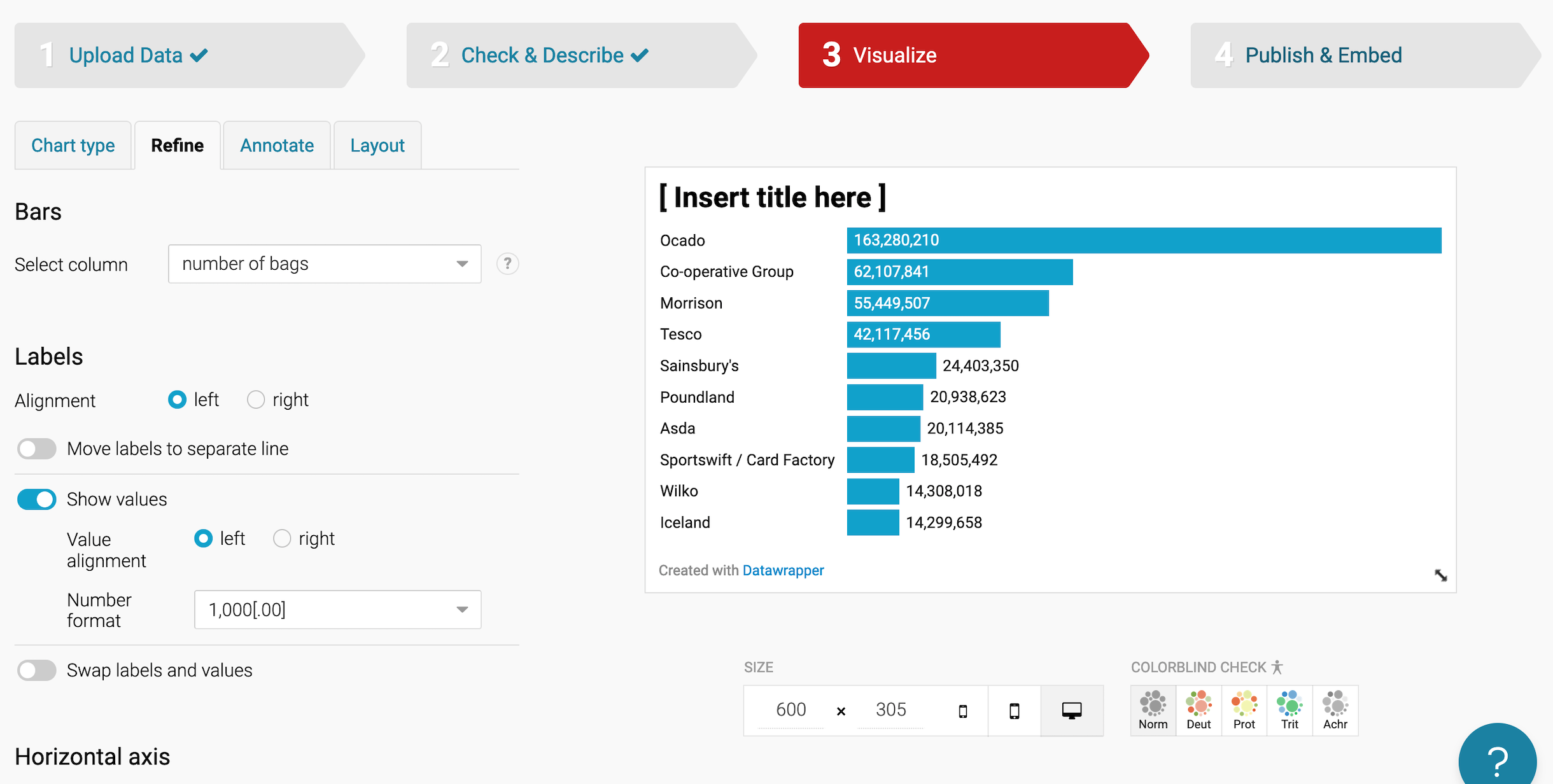
We now have a chart of some kind but it needs to be adjusted so that it makes sense and it’s clear to the reader what it contains.
Use the four tabs Chart type, Refine, Annotate and Layout to build your bar chart
-
Chart type The most effective type of chart in this case is the first, Bar Chart. But you can select other types of chart and see what else works with the data you’ve imported
-
Refine Adjust the appearance of the graph by choosing colours and the labels’ appearance
-
Annotate Add text to explain what the chart shows and where the data came from, using titles and labels
-
Layout Adjust what appears at the bottom of the chart. You can include a link for the user to download the chart data as a CSV file, or to download the chart as a .png image
Once you’re finished you can have it emailed to you (which involves setting up an account) or if you included Download and Embed options when adjusting the Layout you can use those to save the chart locally.
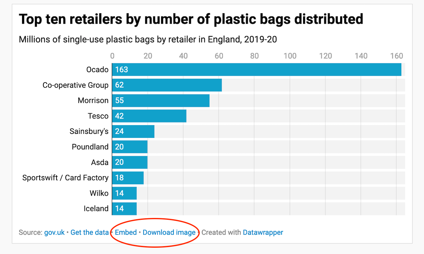
This chart edited the numbers to make it easier to compare, for example, 163 million to 62 million (rather than 163,280,210 to 62,107,841).